
THE CHARMANDER FAMILY

Ah, Charmander, Charmander, Charmander. What to say about you? I don’t really like this line as a whole. I’ve always just sort of found it passe and uninteresting, but objectively, they’re alright ‘mons. It’s just that when I think of Gen 1 and its designs being “less interesting” than later gens, Charmander and its overall line tends to be what my mind jumps to first.
Charmander's design is fine enough, just kind of bland, I feel. One subtle thing about it I really enjoy is the color contrast between its body and eyes; it's a nice touch for the color palette. Otherwise, there isn't really a lot to say about Charmander, it's just kind of a quintessential, generic lizard Pokemon.
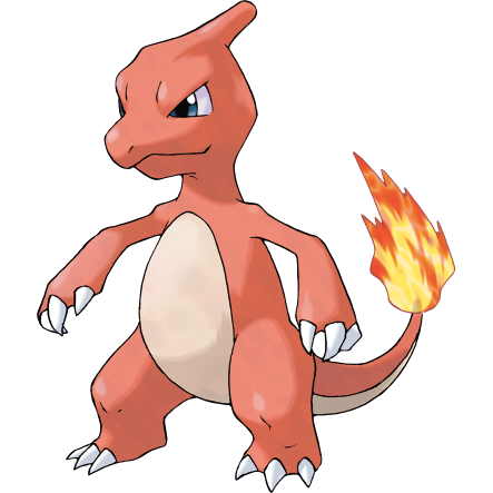
Okay, now we’re getting someplace interesting. You kind of have to feel bad for the middle evolutions in lines like this; they’re the awkward teenagers with more niche followings than their tiny younger and badass older brothers and sisters.
Charmeleon pretty much just enlarges Charmander, makes it angrier, paints it red and gives it a horn. But you know what? That makes it SO MUCH BETTER, and I have no clue why. Something about Charmeleon’s design is a lot more appealing to me than anything else in this line, except for something else we’ll get to a little later. I think one thing I particularly like about it is its lanky proportions, kinda emphasizing that awkward teenager look. It gives me the vibe that Charmeleon's arms grew before the rest of it.
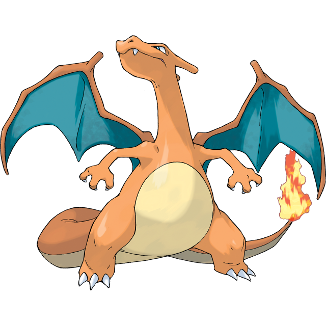
Ohhh, Charizard, you poor thing...this is one of Pokemon's several severely overmarketed designs, which makes it incredibly difficult to look at from a design perspective alone. So many Gamer Dudes™ who are utterly obsessed with this overgrown lizard and I cannot stand it. It does not deserve this.
Charizard’s design as a whole is alright, passable, though I’ve always been one of the people that says Charizard’s shiny colors should’ve been its main ones (why make Charmeleon red if Charizard’s just gonna be orange again?), and this is just the anatomy nerd in me speaking, but I've been bugged by those wings for ages. But overall, Charizard is…not bad, but not fantastic either. It's just okay.
On to this line’s megas! I’m actually pretty excited for these because they improve on what Charizard established really nicely. Charizard is one of only two Pokemon to have more than one mega form, the other being Mewtwo. This is obviously because of this bad boy’s popularity but I’m not going to dwell on that.
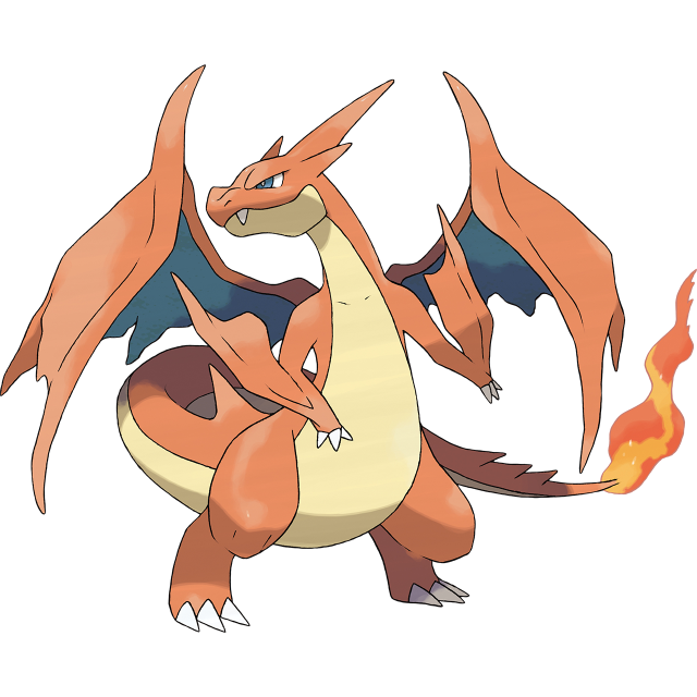
So, Mega Charizard Y. It’s basically just a spikier Charizard with more underbelly and even worse wings (how do you manage that?), but somehow, just taking Charizard and slapping some extra spikes on it makes it a lot nicer to look at. Still not my favorite ‘mon by any means, but it’s better.
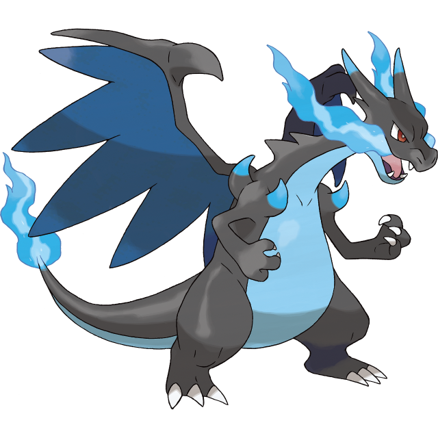
God damn! This is pretty close to what I honestly would have liked Charizard to have been from the beginning. With a way more appealing color scheme that fits nicely into the line’s darkening colors, a more fluid and interesting design, wings that are awful in the best way possible, and gorgeous blue flames pouring from its mouth, this is such a giant improvement over the original Charizard that I’d kill to have this just be its default form. (Though, if it were standard Charizard, I'd probably prefer it to be black and orange, rather than black and blue- fits the overall palette better.)
The one thing I don’t like is the spikes on its shoulders. You could put those on the tip of its tail to frame the tail-fire; that’d be cool.
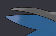
Wait. Wait, actually, no, I need to stop for a moment. I just mentally registered that the wings' membranes don't even attach to the upper finger at the edge and this is pissing me off so much that I need to make you guys look at it too. What the fuck.
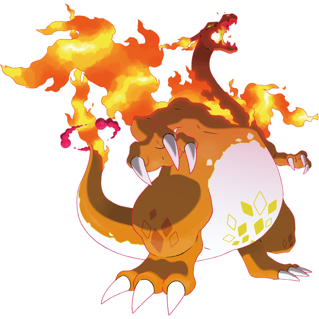
Another Gigantamax pokemon, and one of my absolute favorites. Keeping with the running joke of Charizard's wings, Gmax Charizard just eschews them entirely in favor of wing-shaped plumes of fire, which also grow across its shoulders and sort of evoke a cape of flames. This is already incredibly sick, but then you add the nice diamond-shaped spots on its belly and legs, the extra flames on its horns, and the visible glow of absolute inferno inside of its mouth (with a single billow of fire coming out of one side of its mouth when closed), and it just becomes one of the most absolutely kickass designs Pokemon has ever put out. Hooooooly hell.


PREV ARCHIVE NEXT