
THE SQUIRTLE FAMILY
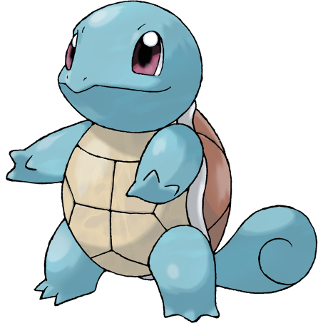
I’m kind of conflicted about the Squirtle line as a whole, and Squirtle is the one that I feel the least about. I’m firmly neutral to this little turtle; its design isn’t particularly notable, but it’s aesthetically pleasing. My one complaint is the color scheme, but honestly it’s not really thaaat big a deal. I love the little curl in the tail.
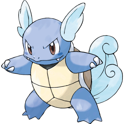
The curious case of Wartortle still baffles me, and is something that was only recently "solved" as it were...but we'll get to that later. I love Wartortle; I think it’s adorable and it follows up nicely from Squirtle, with the big tail feeling like a natural exaggeration of the tiny swirl in Squirtle’s tail, and the color scheme feels like a perfectly natural change as well. It’s like, okay, I can follow with this, it’s got a theme, right? And then things get weird.
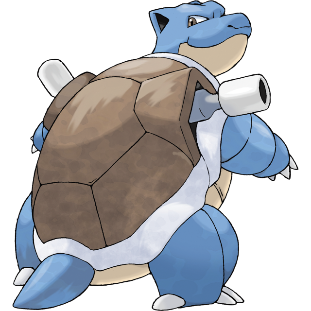
I look at Blastoise, and I’m just…confused. I don’t hate this turret-turtle, not by any means, I just have to question why this. It’s so jarring when compared to what came before it; it almost feels like Blastoise was originally supposed to be completely different, but then the line got tweaked and they just…forgot to change Wartortle, or something? For the longest time, we had no insight on what the hell happened here, but thanks to the fine folks at Helix Chamber (and thanks to Bogleech for making this information easy to find), we finally actually have an answer.
It seems that Blastoise was originally the evolution of an entirely separate line of water turtles, and the Squirtle line originally had a different final evolution altogether, one that followed off of Wartortle's design much better- and they decided to fold the two lines together pretty late in development, and couldn't change them in time to make them fit together better. Oh, game design!
Judging Blastoise entirely on its own, though, it’s…hm. You know what, I don’t think I like this design, actually. The more I stare at it, the more…clunky and unwieldy it feels. Blastoise’s head is very cute, but from the neck down, everything feels…weirdly off-balance, if that makes any sense. It almost feels like it’s not supposed to be bipedal.

This is actually why my favorite sprite of Blastoise has to be the Silver sprite- just by putting Blastoise on four legs, it immediately looks so much better. I wish it could’ve always been like this.
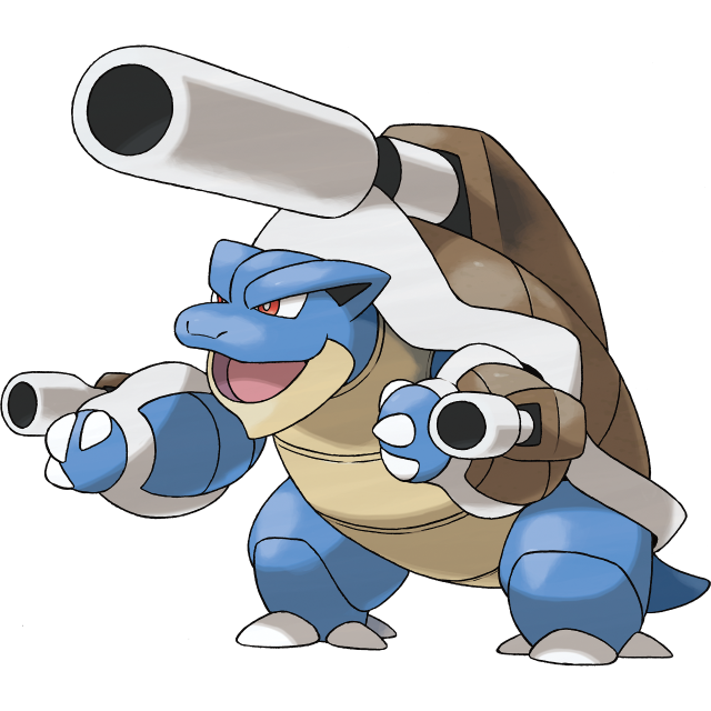
…Yikes. You know what I was saying about Blastoise’s design feeling unbalanced just a second ago? Mega Blastoise somehow manages to take that unbalanced feeling and make it even worse. It still feels like it shouldn’t be upright, but the two back-turrets merging into a single one just makes it even worse. Mega Blastoise looks like it should be falling over onto its face at all times.
Also, the arm-shell-cannons? No, just…no. I do still like its face, though. At least it’s got that going for it.
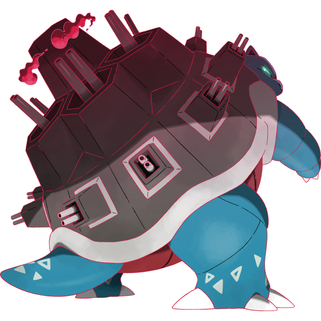
And now we get on to this line's Gigantamax, which is completely fuckin' ridiculous and I lovehate it. Gigantamax a Blastoise and its two shell-cannons turn into an entire fortress of guns, pyramiding its shell to all hell, which is so ridiculous and hilarious and perfect. It's terrible, it's wonderful, I just can't get over the fact that it exists at all. Other than that it's not really much different from base Blastoise at all, still having the problem of not feeling like it should be bipedal, but it does have a slick new color scheme with a nice red belly that I like.


PREV ARCHIVE NEXT